Table of Contents
ToggleBurgundy has emerged as one of the most sophisticated bedroom colors for 2026, offering warmth, depth, and a sense of refined luxury without the coldness of gray or navy. Unlike trend-chasing pastels, burgundy delivers a timeless aesthetic that works equally well in modern minimalist spaces and traditionally styled rooms. Whether you’re planning a full bedroom refresh or exploring accent wall options, understanding how to layer this rich color with complementary decor, furniture, and paint techniques will transform your space into a personal sanctuary. This guide walks you through choosing the right burgundy shade, applying it with professional results, and pairing it with supporting elements that elevate the entire room.
Key Takeaways
- Burgundy bedroom ideas deliver timeless sophistication by combining psychological calmness with visual depth that works in both modern and traditional spaces without the coldness of gray or navy.
- Deep, rich burgundy shades suit bold rooms with good lighting, while muted mauve-burgundy options work better for smaller spaces—always test paint swatches for 24 hours under your actual lighting before committing.
- Accent walls behind the bed offer a lower-commitment way to experience burgundy, requiring proper prep work, primer, and two finish coats applied with overlapping strokes to achieve professional results.
- Pair burgundy walls with cream, ivory, warm whites, and gold or brass accents for contrast and luxury, while jewel tones like emerald and teal create a curated, coordinated look.
- Layer bedding and textiles in neutral creams, soft grays, and whites with one burgundy accent pillow to echo the walls, allowing seasonal flexibility without requiring additional paint work.
Why Burgundy Works as a Bedroom Color
Burgundy is psychologically calming, the deep wine tones signal relaxation rather than stimulation, making it ideal for spaces dedicated to rest and intimacy. Unlike bright reds, burgundy avoids visual harshness. It pairs naturally with a wide range of neutrals (cream, taupe, soft gray) and both warm and cool accent colors, giving you flexibility in furniture and textile choices.
From a practical standpoint, burgundy hides dust and minor wall imperfections better than lighter colors, reducing the frequency of touch-ups in a high-traffic room. The color also maintains its richness in various lighting conditions, it deepens under warm incandescent bulbs and gains sophistication under LED or natural light. If you’re concerned about boldness, starting with an accent wall or feature headboard is a lower-commitment way to test the color in your space before committing all four walls. Interior designers across the industry have embraced burgundy because it conveys investment-quality design without requiring expensive finishes or materials.
Choosing the Right Shade of Burgundy
Deep, Rich Burgundy for Drama and Elegance
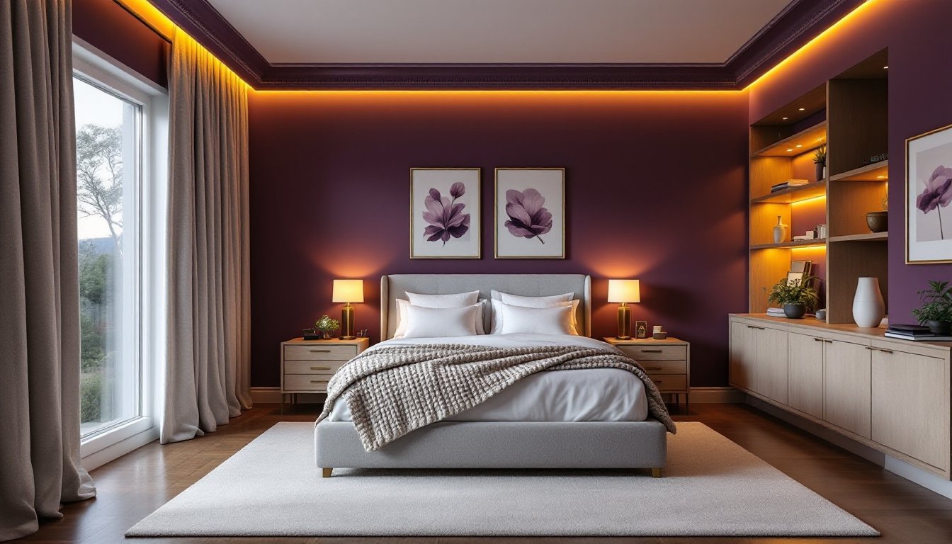
Shades like Sherwin-Williams Borscht or Benjamin Moore Caliente deliver bold, jewel-like depth and work best in rooms with good natural light and generous square footage. These saturated burgundies create visual impact on all four walls, though they demand careful color blocking with white or cream trim to avoid feeling claustrophobic. Deep burgundy suits traditional, eclectic, and contemporary-glamour aesthetics. Apply two coats of quality interior latex paint (avoid cheap flat finishes, which look dingy: opt for matte or eggshell for durability). Test a large swatch on your wall for 24 hours under your actual lighting before committing.
Muted Mauve-Burgundy for Sophistication
Muted, grayed burgundy tones like Farrow & Ball Eating Room Red or PPG Artisan Red feel more reserved and work beautifully as all-over wall color or subtle accent applications. These dusty wine shades pair effortlessly with soft neutrals and can make smaller bedrooms feel intentional rather than cramped. Muted burgundy often appeals to homeowners hesitant about color commitment. Both deep and muted burgundies benefit from quality paint primer (especially if covering bold previous colors): one coat of primer plus two finish coats ensures even coverage and true color representation. Allow proper drying time between coats (check manufacturer specs, typically 2–4 hours) to avoid lap marks.
Accent Wall and Paint Application Techniques
An accent wall, typically the wall behind the bed, allows you to enjoy burgundy’s impact without overwhelming the space. For single-wall applications, select the wall receiving the most natural or ambient light to showcase the color’s depth. Professional painters often choose the focal point wall (usually facing the bedroom entrance) because the eye naturally lands there first.
Prep work is non-negotiable. Clean all walls with a degreaser solution and fill nail holes or imperfections with spackling compound, then sand smooth once dry. Proper surface preparation prevents paint adhesion issues and ensures an even, professional finish. Use painter’s tape along trim, ceiling, and adjacent walls, burnishing edges firmly to prevent bleed-through. Apply primer to bare drywall or dramatically different previous colors: without it, burgundy may appear streaky or require three coats of finish paint.
For application, use a high-quality roller (3/8″ nap for smooth walls, 1/2″ for textured surfaces) and a tapered angled brush for corners and trim lines. Apply paint in overlapping V-shaped or M-shaped strokes, maintaining a “wet edge” to avoid visible seams. Two finish coats on most burgundy shades deliver the richness the color is designed for. Allow full cure time (typically 24–48 hours) before moving furniture back or hanging wall décor. If you’re painting all four walls, many DIYers find the project manageable alone, though a second person makes trim work and ceiling lines significantly faster and cleaner.
Complementary Decor Elements and Color Pairings
Burgundy shines when paired with cream, ivory, and warm whites for contrast and breathing room. Layered neutrals create visual sophistication without clashing with the walls. Gold or brass accents (light fixtures, frames, knobs) add warmth and luxury: chrome or matte black work for contemporary schemes. Soft gray, taupe, and warm beige ground the color without competing.
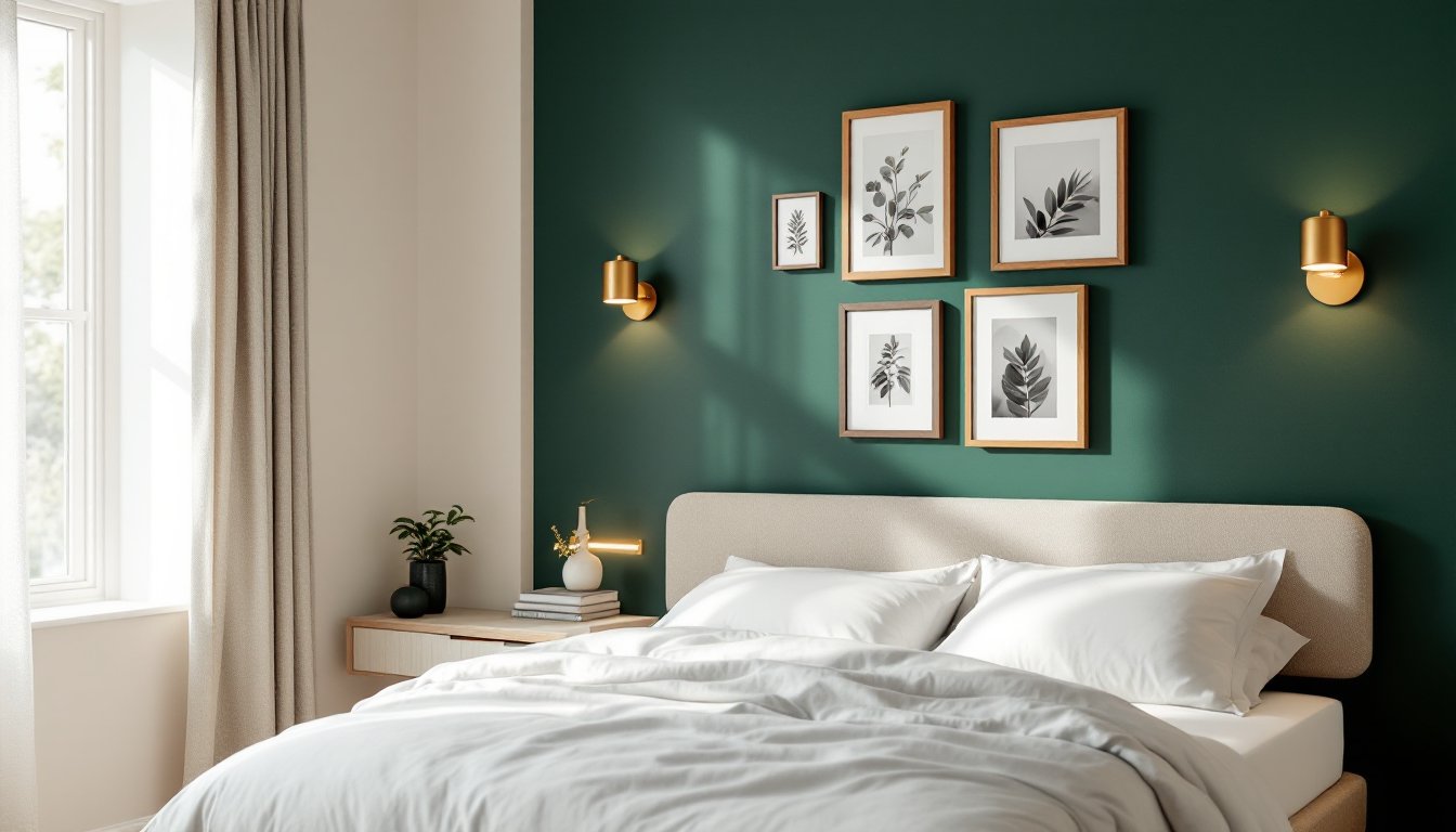
Incorporate pops of secondary color thoughtfully. Deep emerald, forest green, or teal appear rich alongside burgundy and create an inherently coordinated, curated look rather than chaotic. Blush pink or soft gold accents evoke understated glamour. Designers reveal 2026 bedroom trends feature deep burgundy paired with jewel tones and metallics. Avoid bright whites and primary colors, which compete with rather than complement burgundy.
Wall décor should be intentional: large-scale artwork with complementary matting, textile wall hangings, or simple floating shelves in natural wood or painted finishes. Keep accessories to a curated selection rather than crowding surfaces. Modern bedrooms benefit from interior design principles that emphasize clean lines and purposeful styling, avoid generic filler or trendy pieces unrelated to your color story.
Furniture and Textiles to Enhance Burgundy Bedrooms
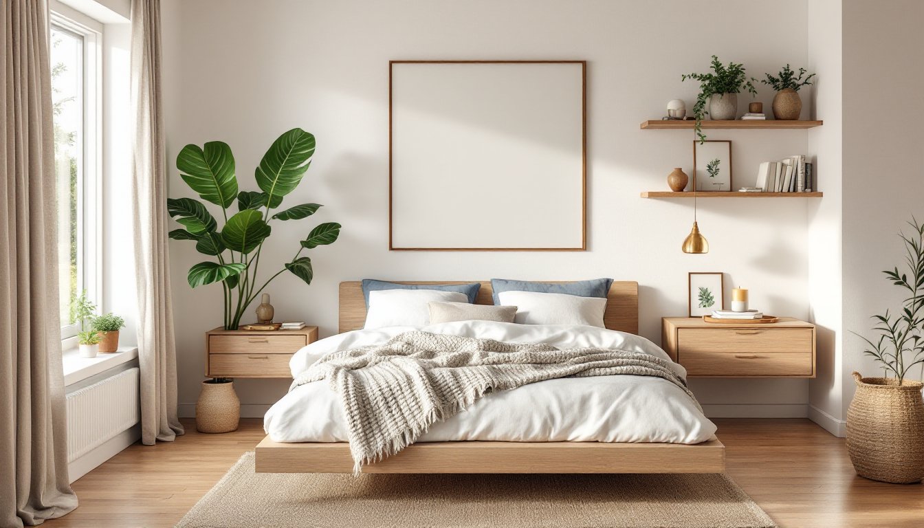
Your bed frame and upholstered pieces set the tone. Light oak, walnut, or gray-washed wood frames balance burgundy’s richness: upholstered headboards in neutral linen or canvas work beautifully or, for drama, match headboard fabric to a slightly lighter burgundy shade for tonal sophistication. Avoid dark wood frames (like ebony) that can feel heavy and closing: pair burgundy with medium to light wood tones for balance.
Bedding should layer texture and neutrality. Start with white, cream, or soft gray sheets, then add a quilted duvet, linen throw, or weighted blanket in complementary neutrals. A single burgundy accent pillow or throw echoes the walls without overdoing it. Layering allows flexibility, change out seasonal throws or pillows without repainting. Curtains frame the entire room, so choose neutral linen, linen-cotton blend, or blackout-lined styles in white, cream, or warm gray. Full-length drapes add formality: roman shades suit contemporary schemes.
Area rugs anchor the seating zone and should be neutral or feature subtle patterns that don’t fight the wall color. A cream or gray rug with low pile suits burgundy: avoid rugs with busy patterns or competing warm tones. Styling tips for room design emphasize how textiles and soft furnishings tie a color scheme together without requiring permanent changes like repainting. Nightstands in natural wood or painted finishes in soft colors keep the focus on layers of softness and warmth rather than visual clutter.